The iPhone SE (2020) Review: A Reinvigorated Classic
by Andrei Frumusanu on April 24, 2020 6:30 AM EST- Posted in
- Mobile
- Apple
- Smartphones
- iPhone SE
- Apple A13
- iPhone SE 2020
Camera - Quick Evaluation
As noted in the intro, the camera of the new iPhone SE isn’t all that new. It’s essentially the same generation sensor as found on the iPhone 8. The reason for this likely is due to the fact that Apple was limited by the physical form-factor of the phone, particularly the z-height of the camera module, unable to include any of the newer and bigger generation modules.
What’s also lacking from the iPhone SE are some of the machine-learning features such as night mode and Deep Fusion. I think that’s partly due to the fact that those modes rely on stacking multiple images captures together, and my hypothesis is that Apple was making use of the newer generation’s sensor dedicated DRAM chips to capture very quick consecutive exposures. As these older sensors lack dedicated DRAM, it wouldn’t be possible to capture quick consecutive exposures like that, and the phone wouldn’t be able to guarantee the same level of quality.
Whilst the hardware limits some of the capabilities of the camera, the new A13’s ISP does make up in other areas when it comes to image processing. Here we’re expecting to see some of the same advancements that were also been able to see in the last few generations of iPhones.
For the camera comparison today, due to the time rush and for simplicity’s sake (it’s a single-camera phone after all!), we’re limiting ourselves to the comparison of the iPhone SE vs the iPhone 8 vs the iPhone 11.
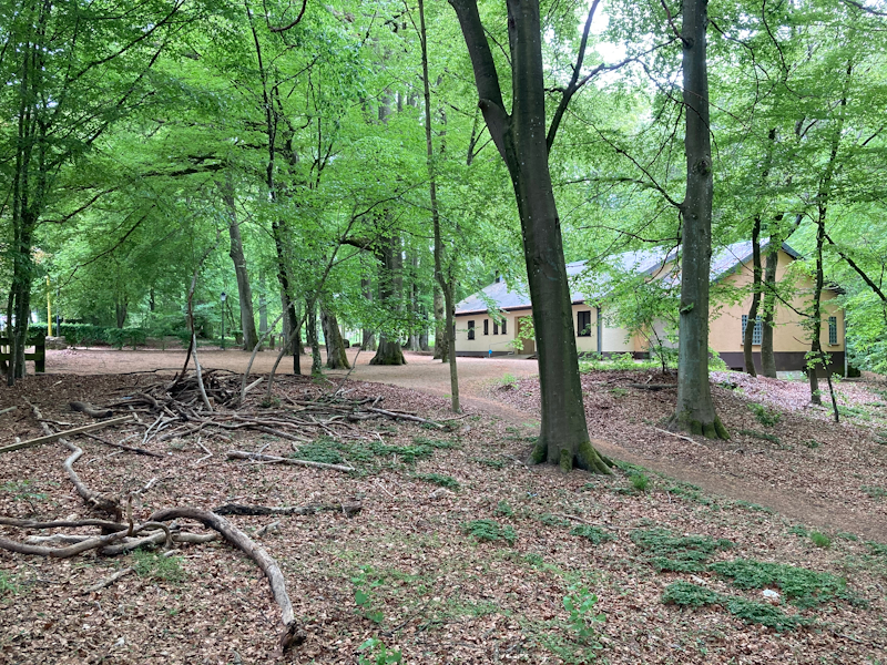
Starting off with the first scene, the first thing that pops out to the eye is that the exposure of the scene is completely different to the iPhone 8, and the new SE almost identically tracks the composition of the new iPhone 11. The HDR processing is much superior, with better retention of shadows as well as less blown-out highlights near the sky.
This scene is also extremely detail-rich, but the new SE essentially tracks in with the iPhone 8’s capture, which makes sense given that the two units have the same camera modules. The iPhone 11 still has a lead here, but again, that makes sense given that phone’s bigger sensor with bigger pixels and much newer deep-trench isolation (DTI), allowing for much better noise characteristics.
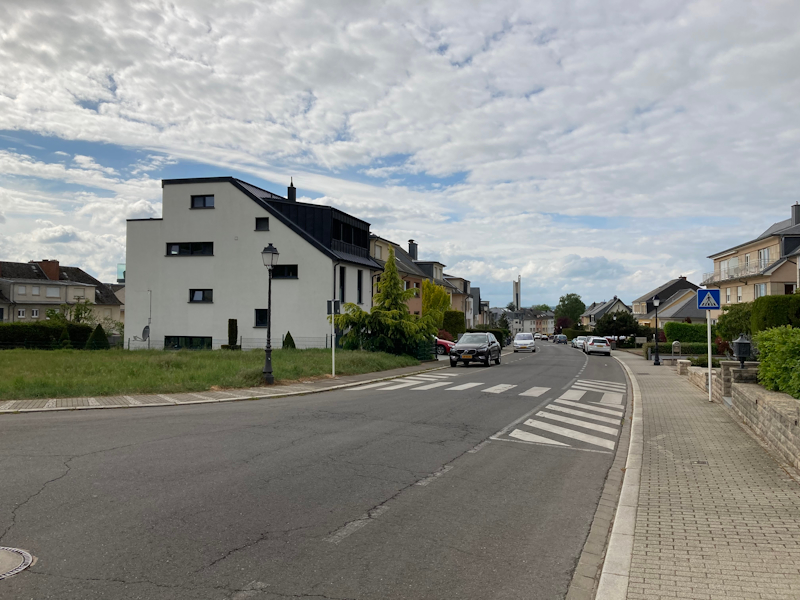
In this next scene, again what’s immediately noticeable is the exposure and composition which closely tracks what the iPhone 11 is able to achieve. All the phones are still a bit dark here as the brightness in real life was much higher, especially the cloud highlights are a bit too tame, but overall, still a good shot.
The SE more noticeably improves noise handling in the darker areas of the scene.
What’s also a big difference between the new SE and the iPhone 11 is the colour temperature of the scene. The iPhone 11 has a much more natural and cooler picture than the very warm results of the SE. Here the SE tracks things more closely with previous generation iPhones which traditionally always had a warm colour cast to them, something that Apple changed only in more recent iPhone generations.
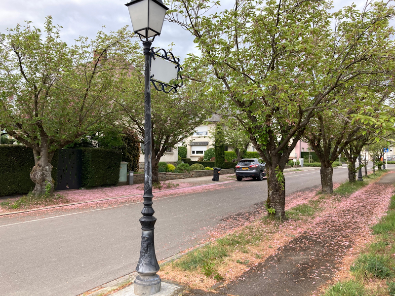
The next shot again is exceedingly similar to the iPhone 11 in terms of composition, with better HDR and more details in the shadows compared to the iPhone 8. Detail is excellent, probably even slightly better than the iPhone 11 here.
This flower shot again marks the huge HDR differences between the SE and the iPhone 8, as the new phone has much better shadows and highlight retention. The iPhone 11 even goes a bit further in this regard and the HDR processing is even stronger (flatter) with a tad more saturation in the greens.
In challenging high-contrast scenes like here we again see the SE do a great job, maintaining better highlights without flattening things too much like on the iPhone 8. There’s also a much better black-point, generally creating better contrast.
When we compared it to the iPhone 11 result, the SE still looks a bit tame and flat, I guess we’re hitting the limits of the sensor. I would have preferred the SE here to track the better colour temperature of the iPhone 11.
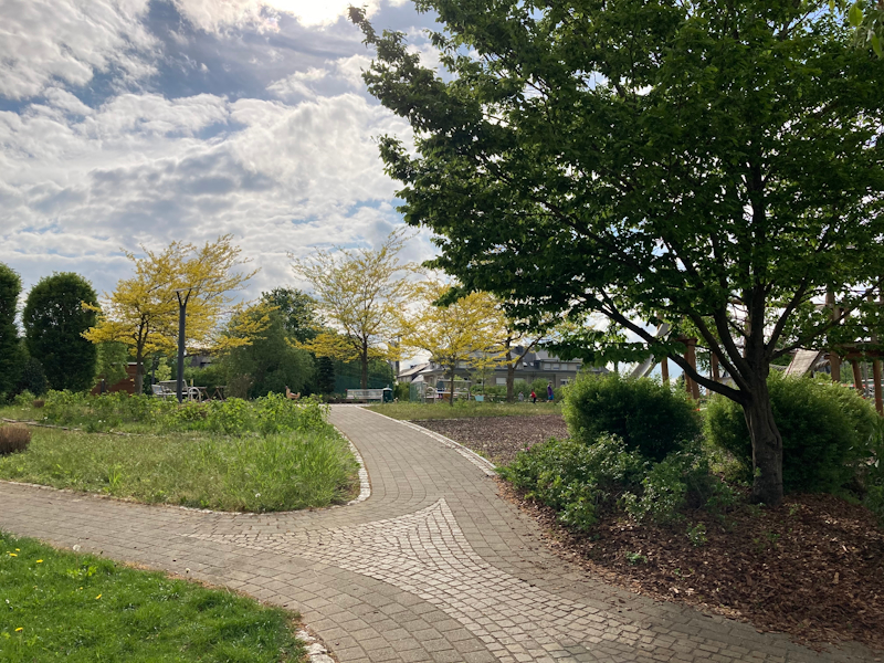
In the last outdoor scene, the iPhone SE does an excellent job in the exposure and HDR. The only obvious differences here that pop out is the colour temperature which is again on the classical iPhone warm style on the SE, versus the cooler more natural colour on the 11.
Even though this is an in-door shot, the iPhone SE’s higher dynamic range is again obviously present in the picture. Detail-wise, it’s rich, but doesn’t quite hold up with the iPhone 11 which in scenarios like this one also very likely has deep fusion enabled.
Overall Initial Daylight Impressions
Overall, the new iPhone SE is seemingly an excellent performer and as promised, it inherits the general image processing capabilities of the new A13 and ends up with similar compositions as found on the iPhone 11. This means that even though the phone has older camera hardware, the new iPhone SE has much better dynamic range compared to the older phones.
Whilst in most situations it closely tracks the iPhone 11’s cameras, there’s a few situations where we do see the limits of the older sensor. In the highest contrast scenes we see the iPhone 11 pull ahead in dynamic range and colour retention, and that’s just pure camera sensor ability.
Detail-wise, while the iPhone SE is excellent and certainly gives any other phone on the market a run for its money, the it’s still a tad behind the iPhone 11 and that’s again due to hardware. Indoor shots the lack of deep fusion will also be noticeable.
All in all – it’s an excellent shooter given its price.
Low-Light Impressions
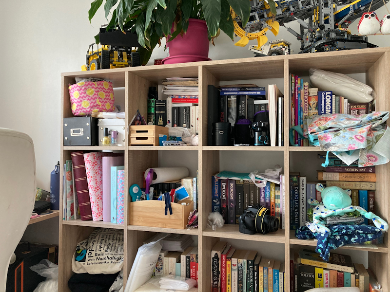
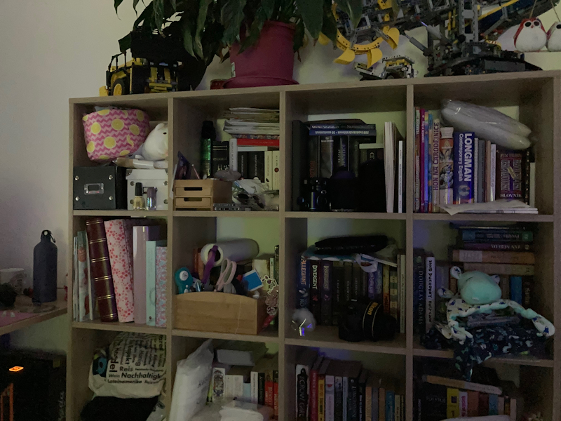
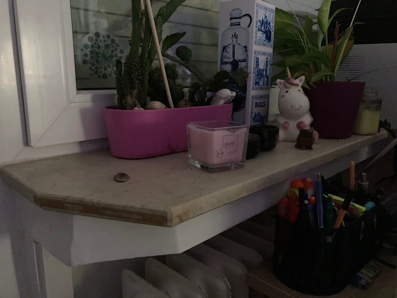
I’ve didn’t have time for a more extensive outdoors low-light testing, but in my limited indoor testing I noted that the new iPhone SE’s low-light capabilities are massively superior to that of the iPhone 8. While the resulting pictures are quite noisy, they still retail a lot of detail of the scene whereas the iPhone 8 remains a blur. It’s a respectable result for the phone given its hardware and software limitations.






196 Comments
View All Comments
ingwe - Friday, April 24, 2020 - link
Very impressed overall. Glad Apple finally released something at this price range again. Time to upgrade from my SE.haukionkannel - Friday, April 24, 2020 - link
I agree, very impressive indeed! This makes most other middle range phones look really bad in comparison!linuxgeex - Friday, April 24, 2020 - link
Hopefully Sandcastle will get to a point where we can install Android 11 on this and end up with a phone we can actually customise and install the software of our choice on vs the limited Apple ecosystem. And I'd love to see whether the Geekbench numbers hold up when running on Android, so we can see whether/how much Apple has been cheating on that benchmark ;-)mrochester - Saturday, April 25, 2020 - link
Why would you want to ruin an iPhone by putting android on it? The whole reason the iPhone is so popular is because it’s NOT android!Oxford Guy - Saturday, April 25, 2020 - link
The last time I tried Android it was so bad I returned the phone.But, iOS is seriously annoying in some ways — like how it spams you with random pop-ups telling you that you can turn on location tracking.
Well, if you choose "Ok" to dismiss the pop-up it turns on location tracking. The only other option you're given is "Open Settings". How many conventions does the pop-up violate?
1) Totally modal? Check.
2) No way to close the window without choosing from bad options? Check.
3) Comes up without any prompting/relevance? Check.
4) Behaves in a way that's user-hostile? Check
5) Behaves in multiple ways that are user-hostile? Check.
6) Violates expected UI conventions ("Ok" to dismiss)? Check.
Of course, one should expect that location tracking is still enabled even if it's "off".
One of the things I always find amusing is how my car always knows I have an iPhone because it's broadcasting Bluetooth even when Bluetooth is "turned off".
Oxford Guy - Saturday, April 25, 2020 - link
7) Gives you two laborious options instead of a simple/efficient option? Check.8) Makes it seem like one option is laborious but the other is simple (deception)? Check.
yeeeeman - Saturday, April 25, 2020 - link
Last time you probably tried android was version 2.0. Now we're at version 10. Try it again.Oxford Guy - Sunday, April 26, 2020 - link
"Last time you probably tried android was version 2.0. Now we're at version 10. Try it again."I tried it before I purchased an iPhone 8.
(Given JCheng's comment, Apple may have changed the behavior of the pop-up between iOS 12 and the most recent, which I believe is 13. I am still using 12 for the moment, despite Apple's harassment over that which is another topic.)
RSAUser - Sunday, April 26, 2020 - link
Android 7? That's quite a while ago, missing a lot of newer things, I'm on 10 currently.Android 8 introduced:
- Project Treble (updates are way faster now due to modularization, I get an update every month)
- Adaptive icons (theming, circle, square, rounded, etc.)
- Notification improvements (channels (grouping), badges, snooze, multi-colors)
- System-wide autofill
- Can limit app background activity and location checks
- Color management for display
- 8.1 onward: Neural networks API, sahred memory API, Bluetooth battery level for connected devices, auto light and dark themes
Android 9:
- Screenshot option to lock menu
- Lockdown mode
- Notifications are "rich", can include images, smart replies, etc.
- Volume slider change (the two bars, that can also pop out to be all media controls without having to go to all the settings)
- Pill gesture system (I kind of still prefer this to the Android 10 gestures, a bit torn)
- "Shush", mute standard notifications if phone is face down
- Adaptive battery (way better hibernation, my phone lasts me two days easy with 7/8 hours screen on)
- Auto brightness based on habits (I think I adjust brightness maybe once a month or so, usually if watching a super dark video)
Android 10:
- New permissions system for once off only, only if shown, etc
- Background apps can't jump to foreground
- AV1 codec support (Netflix uses way less data and space.)
- System-wide dark theme
- New gesture navigation
- Project Mainline: Core OS components updated via google play store, no more restart for those updates or reliant on manufacturer and carrier to approve.
I'm still wondering what Android 11 will bring, since Android 10 is really well fleshed out now, the next couple of updates will be minor things, same for iOS. Only recently used iOS again since ~10, 13 is actually pretty nice, just a little annoyed by how difficult it is to easily connect to specific BT devices, Android still has better pop-up imho, though really happy iOS finally introduced it.
Best thing would have been if iOS left both old and new gestures in, with toggle options for which you want, ah well.
flyingpants265 - Friday, May 8, 2020 - link
I mean.. almost everything in that list is crap.-Keyboard still lags when popping up, when it should be the fastest feature on the entire phone. It's about 5x slower than it should be (I measured against other UI movements)
-App-switching is laggy on every phone.
-App-switcher (Recents) is still UNORDERED EVERY SINGLE TIME, no options to configure this. Each iteration of Recent apps is worse.
-Most of the software takes up way more memory/CPU than it should.
-Most of the apps have very bad UI, lots of clicking through menus and going "back" with the wonky back button, it's truly an adventure.
-Multi-window is useless. We've had widgets for 10+ years (also useless), but nobody thought to put widgets inside multi-window so you can do multiple things from the same screen.
-Can't do basic things like switch between different multi-window panes that are already set up (app1+app2 to app3+app4). Think "multi desktop".
-Can't do basic things like configure swiping left/right between different apps, i.e, I'm in Discord, I swipe left to go to WhatsApp. I swipe right to go to Skype. When I first heard about/saw Android, I saw the "swiping screens around" thing and I was blown away. Turns out, all you can do is swipe between your fucking multiple home screens.
-The battery usage window has EVEN FEWER details, it's actually gotten worse over time, so I can't even really see where 8AM is in the graph.
-Still no way to manually re-order/sticky your notifications in the list, therefore, you'll never develop muscle memory for the notification list.
Doing a simple task like finding an image online, downloading it, cropping it, uploading it to imgur, getting the link, and sharing it to a friend.. takes a full minute, when using Gyazo on a PC takes 6 seconds. I have timed it. On the Android phone, most of the time, you are waiting for lag.. apps to switch, features to load.. then clicking through awful UIs. Somehow, nobody ever thought to just make the software work properly? What happened? Everything worked fine on my Pentium 3. Even Atom can do multi-window, multi-tasking, with full windows apps (not crippled Android apps). Seriously, what happened? Did we all just forget how to write computer programs?
I am usually refuted by saying "Oh yeah, well MY device isn't bad.. MY device isn't slow..." That's because you are not using it properly. Try doing multiple things very quickly, and you will be slowed down by the bad UI/apps/OS, even on the latest flagship phones.
I know what the problem is. People are just content to use what they've got, instead of thinking carefully, and creating a vision of how an ideal phone OS "should" work. It's a form of collective brainwashing, and lack of initiative/creativity. It's really that simple. Fix all these problems first, and make the phones unbreakable/easily repairable, and finally THEN, maybe we can talk about paying $999 for a phone.
iOS is even worse.